Spending Analysis Pie Chart: When It Helps (and When It Lies)
Pie charts are the Instagram filters of personal finance.
They make your spending look curated, balanced, and kind of impressive, even when the underlying reality is you spent $214 on “small treats” and a mysterious subscription called VIDEOPLUS MAX PRO.
And that is exactly why a spending analysis pie chart can be useful and dangerous. It’s a snapshot. It’s also a liar with good lighting.
Meet Jake.
Jake proudly shows me his budget app. “Look,” he says, “Dining is only 9%.”
Nine percent sounds fine. Responsible. Almost European.
Then we click into the category and realize his “Dining” is missing:
- DoorDash fees (categorized as “Delivery”)
- Starbucks (categorized as “Coffee Shops”, separate category)
- Work lunches (categorized as “Uncategorized”, because his app gave up)
- The $380 steakhouse birthday (categorized as “Special Occasions”, because denial is a feature)
Suddenly 9% becomes 22%.
The pie chart didn’t lie. The setup did. And here’s the part nobody talks about: most of America is doing money on hard mode.A CNBC report (Sept 2023) cited surveys showing about 60% of Americans live paycheck to paycheck, 70% feel stressed about finances, and many don’t have meaningful emergency savings or carry credit card debt. When money is tight, “kinda accurate” is not accurate enough.
Source: CNBC
So let’s talk about when a pie chart helps, when it lies, and what to use instead.
When a spending analysis pie chart actually helps
A pie chart is great when you want one thing: mix.
Not trends. Not progress. Not “is this getting better.” Just, “What did my spending look like as a composition?”
Here are the moments it shines.
| Use case | Why the pie chart works | The one rule that keeps it honest |
|---|---|---|
| Big picture reality check | It shows your top categories at a glance | Use broad groups (8 to 12 max), not 37 micro-categories |
| Fixed vs variable spending | The slices make tradeoffs obvious (housing vs everything else) | Group categories into 2 to 4 big buckets first |
| Partner conversations | It’s easy to talk about without needing an MBA | Agree on category definitions before you argue about the results |
| “Where can I cut without pain?” | The biggest slices are your leverage | Only compare months after cleaning categories and removing transfers |
A good pie chart is like a good mirror. It won’t flatter you, but it will show you where the problem is.
A bad pie chart is like a funhouse mirror. Technically reflective, spiritually useless.
When a pie chart lies (even when the math is correct)
The pie chart’s core weakness is also its charm: it compresses reality into a clean circle.
But personal finance is not a circle. It’s a mess of timing, psychology, and weird merchant names.
Lie #1: The denominator problem (aka “what did you divide by?”)
A pie chart is “percent of total.” Cool. Percent of what, exactly?
Common ways people accidentally sabotage the denominator:
- Transfers are counted as spending. (Hello, credit card payments. Hello, moving money between accounts.)
- Reimbursements are missing. (Work travel looks like lifestyle inflation if you don’t record the repayment.)
- One-off big expenses distort everything. A $4,000 car repair turns your month into a horror movie.
If your total includes non-spending transactions, your pie chart becomes modern art.
Quotable truth: Percentages don’t lie, but denominators cheat.
Lie #2: Time lies (because life is seasonal and your chart isn’t)
A pie chart is usually one month.
Life is not one month.
Your spending has seasons:
- December: gifts, travel, festive financial sabotage
- Summer: camps, flights, weddings, “just one more weekend trip”
- Annual bills: insurance, memberships, property taxes
If you read one month’s pie chart like it’s your personality, you’ll overcorrect. You’ll cut the wrong things. Then you’ll “fall off the budget” and blame yourself instead of the timeline.
Better framing: Pie charts are weather, not climate.
Lie #3: Categories lie (because your data is messy)
Most people don’t have a spending problem. They have a categorization problem wearing a spending problem costume.
The classic category lies:
- Amazon/Target/Costco chaos. One merchant, ten types of purchases, one lazy category.
- “Miscellaneous” becomes a landfill. Everything goes there, including your self-respect.
- Splits never happen. That $210 grocery run included $48 of household stuff and $19 of impulse candles.
- Subscriptions hide inside other categories. Streaming gets buried in “Entertainment,” then multiplies.
If your categories are wrong, your pie chart becomes confident misinformation.
If you want a clean category system, start with a simple budgeting categories setup that doesn’t collapse in two weeks.
The Pie Chart Truth Test (steal this)
Before you trust a spending analysis pie chart, run this quick audit. If you fail 2 or more, your chart is guilty until proven innocent.
- Are transfers excluded? (Credit card payments, account-to-account moves)
- Are reimbursements tracked? (Work, friends, family, insurance)
- Did you look at at least 90 days? (One month is a mood swing)
- Is “Uncategorized/Misc” under 3%? (Over that, your chart is basically “???%”)
- Are lumpy expenses monthlyized? (Insurance, annual memberships, car maintenance)
- Are the top merchants clean? (Amazon and friends need splits or labels)
- Can you explain every slice without apologizing?
If you can’t explain a slice, don’t optimize it. First you clean it.
What to use instead (because you’re trying to answer better questions)
Most people stare at a pie chart when what they really want is one of these:
- “Am I improving?”
- “What changed?”
- “What is driving my stress?”
- “What’s killing my savings rate?”
A pie chart cannot answer those. Here’s what can.
| The question you actually care about | Use this instead of a pie chart | Why it’s better |
|---|---|---|
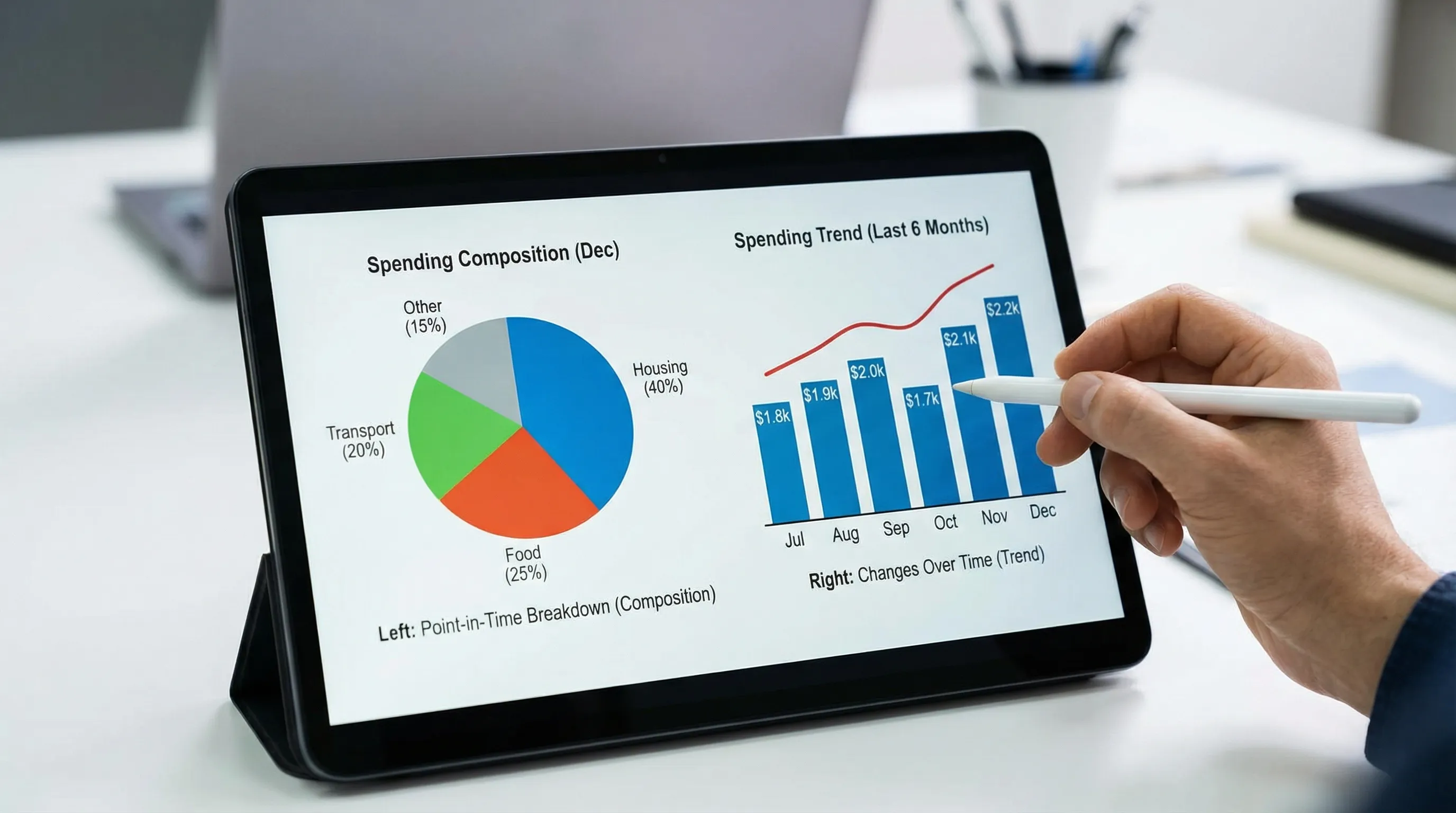
| Is my spending trending up or down? | Line chart of total spending by month | Time tells the truth when slices don’t |
| What changed vs last month? | Variance view (this month minus last month) | Change is the only thing worth debugging |
| What’s eating my flexibility? | Fixed vs variable breakdown | Fixed costs set your financial “difficulty level” |
| Where can I cut fast? | Top merchants + subscriptions list | You can’t negotiate with a category, you can cancel a charge |
| Am I on track for FIRE? | Savings rate trend + net worth trend | FIRE is a scoreboard, not a vibe |
And yes, this is where most Mint-era apps started to feel dated. They gave you pretty charts, then left you alone with the interpretation.
A modern tracker should help you go from “interesting” to “actionable.”
How to make a pie chart that tells the truth (15-minute workflow)
You don’t need a new personality. You need a repeatable system.
Here’s a clean workflow you can run monthly, whether you use FIYR or another tool.
Step 1: Start with fewer categories than you want
If you have 28 slices, your brain will treat the whole chart as background noise.
Aim for 8 to 12 spending categories for the pie chart view, then use labels (or notes) for detail.
Example: “Travel” as one slice, then labels like “NYC Trip 2026” for the receipts.
In FIYR, this is where custom categories and category groups shine because you can keep the pie chart clean without losing detail.
Step 2: Build rules so your pie chart stops drifting
If “Starbucks” is Coffee this month and Dining next month, your chart becomes a random number generator.
Use transaction rules for your most common merchants.
If you want the deeper playbook, read how spending rules automation keeps categorization accurate.
Quotable truth: A budget without rules is just a diary with math.
Step 3: Separate “money movement” from “money spent”
Your pie chart should show spending, not financial plumbing.
Make sure these are not treated as expenses:
- Credit card payments (they are transfers)
- Savings transfers (also transfers)
- Investing contributions (depending on how you track, often transfers)
If your app counts these as spending, the pie chart will scream “You spent 41% on Paying Yourself,” which sounds noble and is also nonsense.
Step 4: Monthlyize lumpy expenses so your pie chart doesn’t panic
If you pay car insurance every 6 months, that month will look like you bought a used jet.
The fix is simple: sinking funds, or a “true expenses” category that gets funded monthly.
If you want the full system, here’s the sinking funds guide.
Step 5: Pair the pie chart with one metric that actually matters
A pie chart is a snapshot. Your life is a movie.
If you’re FIRE-minded, the metric that turns spending into meaning is your savings rate:
Savings rate = (Income minus Spending) / IncomeA smaller Dining slice is nice. A higher savings rate is freedom.
In FIYR, this is where the combo of income tracking, spending tracking, and savings rate plus FIRE projections makes the chart more than decoration.
The stealth danger: pie charts make small leaks look harmless
This is where people get fooled.
A $39 subscription looks like nothing in a pie chart. It’s a hair on the floor.
But subscriptions are not hair. They are moss. They grow quietly and then suddenly your bank account smells like a basement.
This is why pairing a spending analysis pie chart with subscription tracking is lethal (in a good way). Your chart shows the mix, your subscription list shows the recurring commitments that quietly hijack your future.
If you want to hunt those down, see the guide to managing subscription renewals.
A simple “honest reporting” setup (works for ex-Mint users)
If you’re coming from Mint, you probably want the same comfort (all accounts, one dashboard) with less chaos and more control.
Use this reporting stack:
- Pie chart: category mix for the last 90 days
- Trend line: total spending by month for the last 12 months
- Subscription list: recurring charges, sorted by amount
- Fixed cost ratio: fixed bills / income
- Savings rate trend: monthly, because motivation needs receipts
This is basically what a modern finance platform should do by default: help you see the story, not just the circle.

Frequently Asked Questions
Are pie charts bad for budgeting? Pie charts are not bad, they are just limited. They work for understanding your spending mix, but they’re weak for trends, progress, or explaining what changed. What is the best timeframe for a spending analysis pie chart? Use at least 90 days for a more stable view. One month can be distorted by travel, annual bills, or one-time purchases. Why does my pie chart show huge “uncategorized” spending? Usually because merchants are messy (Amazon), rules are missing, or transfers and reimbursements are being misread. Clean categories and add transaction rules to lock consistency. Should credit card payments show up in a spending pie chart? No. Credit card payments are typically transfers, not spending. The spending happened when you swiped the card. What’s better than a pie chart for FIRE planning? Savings rate and net worth trends. FIRE is driven by how much you keep and invest, not just how the spending slices look. ---Use the pie chart as a flashlight, not a bedtime story
A spending analysis pie chart is helpful when it reveals reality. It’s harmful when it helps you rationalize it.
So use it like a flashlight:
- Big slices show leverage.
- Weird slices reveal data hygiene problems.
- Small slices are where subscriptions hide and multiply.
If you want a tool that makes the “truth” version easier, FIYR is built for exactly this: clean spending tracking, flexible budgets, custom categories, rules, subscription visibility, plus savings rate and FIRE insights that turn charts into decisions.
Start simple: connect accounts, clean categories, add a few rules, then let your pie chart earn your trust.